Living in a sterile, white-box apartment doesn’t mean you’re condemned to a cold atmosphere. The solution isn’t just adding more things; it’s about understanding how texture manipulates light, sound, and touch. By strategically choosing materials based on their physical properties—like the deep pile of velvet or the light-refracting quality of limewash—you can orchestrate a sensory experience that absorbs coldness and builds a profound, tangible warmth, transforming your rental into a true sanctuary.
That stark, echoing feeling of a white-box apartment is a familiar challenge for many renters. You’re surrounded by flat, lifeless surfaces, and the rules say “no paint.” The common advice is to throw in a rug and some pillows, but this often just results in a collection of objects in a cold room, not a cohesive, warm environment. You’re left with a space that looks decorated but feels fundamentally sterile, lacking soul and comfort. It’s a frustrating cycle of trying to fix a feeling with objects that only address the visual, ignoring the other senses that contribute to our perception of warmth.
But what if the answer wasn’t in adding more, but in being more intentional? What if the key to unlocking warmth lies in a language your senses already understand: the language of texture? The transformation from sterile to sanctuary is not about color, but about conducting a sensory dialogue between light and surface. It’s about understanding that a chunky knit throw doesn’t just look warm; its very structure traps air and absorbs sound, physically altering the room’s atmosphere. The “cold” feeling of a minimalist space is often an acoustic issue as much as a visual one—an echo that smooth surfaces perpetuate.
This guide moves beyond generic advice. We will delve into the physics and psychology of texture. You will learn not just *what* to add, but *why* specific materials work. We will explore how to use the deep pile of fabrics to absorb light and sound, how to choose wall finishes that create dynamic shadows, and how to master lighting techniques that make surfaces come alive. Prepare to stop decorating and start sculpting an atmosphere, turning your sterile rental into a space that feels as warm and inviting as it looks.
To guide you in this sensory transformation, this article breaks down the essential strategies for mastering texture. We will cover everything from the scientific reasons certain fabrics feel warmer to the practical steps for lighting your textured walls for maximum effect.
Summary: How to Add Warmth to a Sterile Room Using Only Texture?
- Why Velvet Curtains Make a Room Feel Warmer Than Cotton
- How to Transition Your Sofa Pillows From Summer to Winter?
- The Dust Trap Mistake: Which Textures to Avoid if You Have Allergies?
- Wallpaper or Limewash: Which Adds More Depth to a Flat Wall?
- How to Pair Rough Stone With Sleek Glass for Modern Contrast?
- Uplighting vs. Downlighting: Which Is Best for Textured Stone Walls?
- Why Grazing Light Is the Best Way to Highlight Brick Texture
- How to Hang Heavy Macramé Wall Art Without Damaging Drywall?
Why Velvet Curtains Make a Room Feel Warmer Than Cotton
The feeling of warmth that velvet imparts is not just an illusion; it’s rooted in physics. Unlike the flat, smooth weave of cotton which reflects light and sound, velvet possesses a dense, raised pile. These countless tiny fibers create a complex surface that does two critical things to alter the sensory experience of a room. First, it absorbs light. As a study on textural perception in design notes, “Raised textures (coarse or soft) absorb more light, so they convey a sense of warmth.” This light-trapping quality reduces glare and creates a softer, more intimate visual environment.
Second, and perhaps more importantly for a sterile room, velvet fundamentally changes the acoustics. The deep pile acts as a natural sound buffer. Hard, flat surfaces like drywall and glass cause sound waves to bounce around, creating the sharp echoes that we perceive as cold and unwelcoming. Velvet’s plush structure absorbs these sound waves, dampening reverberation and creating an immediate sense of quiet and calm. In fact, research into acoustic textiles shows that dense velvet drapes can reduce mid-frequency noise by over 45%, a significant factor in making a space feel more like a sanctuary and less like a sterile box.
This dual power of light and sound absorption is what makes velvet a superior choice for generating warmth. While a cotton curtain might block a view, a velvet one actively reshapes the room’s sensory profile. It subtracts the harshness of light and sound, leaving behind a softer, richer, and more enveloping atmosphere. It’s a material that doesn’t just hang—it performs.
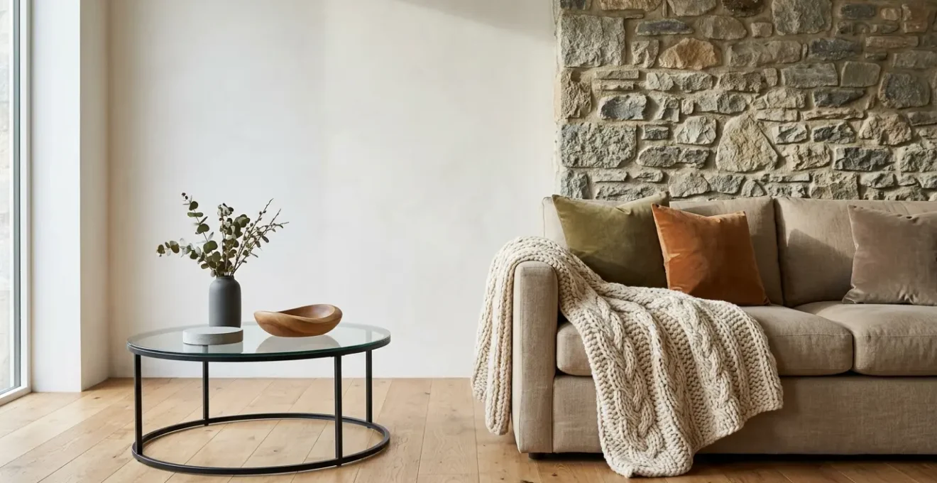
How to Transition Your Sofa Pillows From Summer to Winter?
Transitioning your living space for the colder months is a tactile ritual, and nowhere is this more evident than with your sofa pillows. It’s a simple change that can fundamentally alter the room’s perceived temperature and coziness. The key is to swap out the “cool” textures of summer—like crisp linen and light cotton—for materials with greater visual and tactile weight. Summer fabrics are typically lightweight and have a smooth, cool hand-feel, designed to feel refreshing. Winter textures, in contrast, are meant to look and feel insulating.
To execute this transition effectively, think in terms of both look and feel. Your goal is to create a sense of substance and comfort. Begin by replacing airy, light-colored linen with pillows made from chunky knits, bouclé, faux fur, or shearling. These materials have a substantial presence that grounds the space. Then, consider the tactile experience. Fabrics like flannel, cashmere, and velvet not only look warmer, but they also provide a soft, insulating touch. Velvet is particularly effective because its deep pile enhances color saturation, making hues appear richer and more enveloping under the soft light of winter.
As you can see in the texture above, the deep pile of the fabric creates micro-shadows that give it incredible depth. Don’t be afraid to layer. A successful winter pillow arrangement is a conversation between different textures. Combine two or three contrasting yet complementary materials to create a rich, inviting landscape on your sofa. For example, pair the smooth, cool sheen of a velvet pillow with the nubby, organic feel of a wool knit and the soft plushness of a faux fur cushion. This multi-sensory approach is what truly banishes the cold. Here’s how to do it systematically:
- Assess Visual Weight: Replace light summer fabrics like linen with visually heavier winter materials like chunky knits or bouclé.
- Evaluate Hand-Feel: Swap crisp, cool percale for textures that offer insulation and a soft touch, such as shearling or flannel.
- Deepen Color Saturation: Choose materials like velvet or chenille that naturally make colors appear richer and warmer through their interaction with light.
- Layer Textures: Combine 2-3 contrasting textures (e.g., smooth velvet, nubby wool, soft fur) to create depth and sensory interest.
The Dust Trap Mistake: Which Textures to Avoid if You Have Allergies?
While a deep, shaggy rug or a high-pile throw can feel wonderfully cozy, they can quickly become a nightmare for allergy sufferers. These open, loose-weave textures are essentially perfect nets for dust mites, pet dander, and pollen. The very structure that makes them feel plush provides an ideal habitat for allergens to accumulate and thrive, releasing them back into the air with every step or movement. For those sensitive to airborne irritants, making the “dust trap mistake” means trading atmospheric warmth for chronic discomfort.
The solution isn’t to live in a texture-free void, but to choose your materials wisely. The key is to opt for tightly-woven, low-pile fabrics. Materials like leather, tightly-woven wool, microfiber, and denim are much less hospitable to dust mites. Their dense structure provides fewer places for allergens to hide and makes them significantly easier to clean. When considering rugs, look for low-pile options or flatweaves like jute or sisal, which can be vacuumed effectively. For bedding and upholstery, using high-quality barrier fabrics or encasements is a proven strategy, as clinical testing shows they can reduce exposure to dust mite allergens.
Case Study: The Science of Allergen-Proof Weaves
To understand the difference, consider a 2023 study on allergen avoidance. Researchers found that for a fabric to act as an effective physical barrier, it needs to be woven with extreme tightness to reduce its pore size. These densely-woven materials successfully blocked mite allergen particles while remaining breathable. They vastly outperformed the loose, high-pile fabrics, which were identified as prime environments for trapping dust and providing a habitat for allergens to multiply. This confirms that the secret to allergy-friendly texture lies in the microscopic density of the weave, not the smoothness of the surface.
Ultimately, creating a warm, textured home that is also allergy-friendly requires a shift in focus from “shaggy” to “structured.” By prioritizing materials with a dense construction, you can enjoy the sensory benefits of texture without compromising the air quality of your living space. It’s a mindful approach that ensures your cozy sanctuary remains a healthy one.
Wallpaper or Limewash: Which Adds More Depth to a Flat Wall?
When faced with the flat, featureless expanse of a rental’s white walls, adding physical depth is the most transformative step you can take. Two powerful, renter-friendly options are textured wallpaper and limewash-effect finishes. While both add dimension, they do so in fundamentally different ways, creating distinct emotional qualities. Textured wallpaper, such as grasscloth or cork, offers a static, predictable depth. Its pattern is uniform, catching light at consistent angles to create a polished, intentional design. It’s an excellent choice for an accent wall where you want a clear focal point and a controlled visual statement.
Limewash, on the other hand, offers a dynamic, living depth. Whether it’s authentic plaster or a high-quality limewash-effect wallpaper, its defining feature is the subtle, hand-brushed movement across the surface. This organic variation interacts with natural light in a completely different way. As the sun moves across the room, the color and shadows on the wall shift, creating a soft, velvety effect that feels soulful and authentic. As the CostaCover Design Team notes, this quality is intentional: “Faux limewash wallpaper is designed to mimic the hand-applied brush movement of authentic limewash plaster. This subtle variation catches light differently throughout the day, giving walls a more dynamic presence.”
The choice between the two depends on the atmosphere you want to create. Textured wallpaper is about adding a decorative layer of interest, while limewash is about changing the very character of the light in the room. This comparison table highlights their unique contributions to depth.
| Feature | Limewash (Paint or Wallpaper) | Textured Wallpaper (Grasscloth, Cork) |
|---|---|---|
| Type of Depth | Dynamic depth – shifts with natural light throughout the day | Static depth – consistent pattern, predictable texture |
| Visual Movement | Organic hand-brushed strokes create ‘living’ wall effect | Uniform pattern creates visual interest but remains static |
| Light Interaction | Velvety matte texture refracts light, color/shadows shift | Texture catches light consistently at fixed angles |
| Emotional Quality | Wabi-Sabi aesthetic – authentic, handmade, soulful character | Polished, intentional design – more formal or decorative |
| Best Use | Main walls for soft atmospheric effect | Accent walls for focal points and visual contrast |
Ultimately, for transforming an entire sterile room, the dynamic, light-refracting nature of limewash often provides more profound and atmospheric depth than the static pattern of most textured wallpapers, as shown by this insightful comparative analysis. It turns a flat wall into a canvas for light.
How to Pair Rough Stone With Sleek Glass for Modern Contrast?
Pairing rough, earthy stone with cool, sleek glass is a hallmark of modern design, but it’s a delicate balancing act. Done poorly, the contrast can feel jarring and cold. Done well, it creates a sophisticated sensory dialogue between the raw and the refined. The secret isn’t to just place them next to each other, but to thoughtfully mediate their relationship. Both materials read as “cold” to the touch and eye, so the primary goal is to introduce elements that bridge their differences and inject warmth into the composition.
The first professional principle is to use a bridging element. This is a third material with an intermediate texture, like matte black metal, natural wood, or brushed brass. A wooden frame around a glass pane on a stone wall, or metal legs on a glass table placed on a slate floor, creates a visual transition that helps the eye move smoothly from one extreme texture to the other. This third element acts as a translator in the material conversation.
The second principle is to balance their sensory temperature. Since stone and glass are tactilely cold, you must introduce a “warm” texture nearby to balance the equation. This could be a plush wool rug under a glass coffee table, a soft bouclé armchair next to a stone fireplace, or even warm-toned lighting that reflects beautifully in the glass. This ensures the overall composition feels balanced and inviting, not stark. Follow these key steps for a successful pairing:
- Introduce a Bridging Element: Use matte metal, wood, or brushed brass to create a visual link between stone and glass.
- Balance Sensory Temperature: Add a “warm” texture like a wool rug or plush upholstery nearby to counteract the coldness of stone and glass.
- Apply the Rule of Proportionality: Match the scale of the elements. A massive stone wall needs a substantial glass piece to feel balanced.
- Create Color Cohesion: Use a unifying color found in both the stone’s veining and the glass (as a tint or backing) to tie them together.
Uplighting vs. Downlighting: Which Is Best for Textured Stone Walls?
Once you have a textured surface like a stone wall, lighting becomes your most powerful tool for expression. The direction of your light source—whether from above (downlighting) or below (uplighting)—will dramatically alter how the texture is perceived and the overall mood of the room. Neither is inherently better; they simply serve different artistic purposes. The choice depends entirely on the atmosphere you wish to create.
Downlighting, where light grazes the wall from a ceiling-mounted fixture, creates an effect that feels natural and intimate. It mimics the way sunlight naturally falls, casting long shadows downward from every protrusion in the stone. This technique emphasizes the horizontal lines and grounding nature of the material, making a space feel cozy and established. It’s ideal for living rooms or bedrooms where you want to create a comfortable, relaxing ambiance.
Uplighting, with fixtures placed on or near the floor, produces a more dramatic, theatrical effect. By casting shadows upward, it defies our natural expectations of light and makes the wall feel taller and more monumental. This technique is often used in architectural design to highlight columns or grand facades, and it can bring that same sense of drama indoors. It’s perfect for entryways or feature walls where you want to make a bold, sculptural statement. Lighting design research shows that the distance is critical: fixtures placed 12 inches or less from the wall create the most effective grazing effect, with narrow beams creating sharp, deep shadows.
Different color temperatures of static white can enhance a material’s features and natural hues while dynamic tones, static color and RGB combinations can create entirely new effects.
– QTL Lighting Design Team, Master Wall Grazing Lighting for Stunning Accent Lighting
Beyond direction, the color temperature of your light bulb adds another layer of control. A warm white light (2700K) will enhance the earthy tones in the stone, amplifying the feeling of warmth, while a cool white light (4000K) will emphasize its raw, mineral quality for a more modern look.
Why Grazing Light Is the Best Way to Highlight Brick Texture
To truly make an exposed brick wall the hero of a room, flat, direct lighting is your enemy. It washes out the surface, erasing the very character you want to celebrate. The most effective method by far is wall grazing. This technique involves placing a light source very close to the wall, either on the ceiling or the floor, and aiming the light to skim down or up the surface at a steep angle. The effect is transformative.
The physics are simple yet dramatic: light striking the wall at such a low angle causes every protrusion—the face of each brick—to catch the light and cast a deep, elongated shadow into every recess—the mortar joints. This extreme contrast between light and shadow tricks our brain into perceiving exaggerated depth and roughness. It turns a subtly textured wall into a dramatic, three-dimensional landscape. For this to work, placement is everything; professional lighting designers recommend that light fixtures should be mounted within 12 inches of the wall surface for the optimal effect.
As with stone, the direction of the graze sets the mood. Grazing from the ceiling down feels natural and grounding, perfect for a cozy, rustic feel. Grazing from the floor up is theatrical and unconventional, making the brick feel imposing and monumental. To avoid the common pitfall of “scalloping”—distracting U-shaped hot spots on the wall—it’s best to use continuous linear LED fixtures or specialized track lights rather than poorly spaced individual spotlights. This creates an even “sheet” of light that enhances the entire surface uniformly.
Action Plan: Perfecting Your Grazing Light
- Understand the Physics: Recognize that a low light angle creates long shadows from every protrusion, which is what generates the perception of deep texture.
- Source the Right Fixture: Choose linear LED fixtures or specialized wall-grazing track lights to avoid the uneven “scalloping” effect caused by poorly spaced spotlights.
- Determine Your Directional Intent: Decide between down-grazing from the ceiling for a natural, grounding feel, or up-grazing from the floor for a dramatic, theatrical effect.
- Control the Beam Angle: Select fixtures with a narrow beam angle (around 15-25 degrees) to ensure the light is precisely directed along the wall for maximum texture emphasis.
- Test and Adjust: Position the light at various distances within the 12-inch range to see how it affects the shadow length and find the perfect balance for your desired look.
Key takeaways
- True warmth comes from manipulating light and sound, not just adding objects. Focus on textures that absorb light and dampen echo, like velvet and chunky knits.
- Wall treatments like limewash offer “dynamic depth” by interacting with shifting natural light, making a room feel alive and soulful.
- Mastering “grazing light”—placing lights close to a wall to rake across the surface—is the most powerful way to reveal the hidden three-dimensional character of brick or stone.
How to Hang Heavy Macramé Wall Art Without Damaging Drywall?
A large, heavy macramé wall hanging is a fantastic way to introduce a massive dose of soft, natural texture and visual weight into a sterile room. However, for a renter, the fear of damaging the drywall can be a major deterrent. A simple nail or screw is not enough; the weight of the piece will eventually pull it out, leaving you with a fallen artwork and a hole to patch. The solution lies in using the wall’s internal structure and the right hardware to distribute the weight safely and securely.
Your first and most important tool is a stud finder. The studs are the vertical wooden beams that form the frame of your wall. Attaching your hardware directly into a stud is the most secure method, as you are anchoring into solid wood, not hollow drywall. Use an electronic stud finder to locate the center of a stud in your desired hanging location. Once located, you can drill a pilot hole and use a long, sturdy screw to mount your bracket or dowel holder. This method is often strong enough to hold even very heavy pieces.
If there isn’t a stud in the perfect spot—a very common problem—you must use a specialized drywall anchor. Do not use the small, plastic anchors that come with many kits; they are not designed for heavy loads. Instead, opt for one of these two robust options:
- Toggle Bolts: These are the workhorses for heavy items. A toggle bolt consists of a screw and a spring-loaded “wing.” You drill a hole large enough for the folded wing to pass through. Once inside the wall cavity, the wings spring open, bracing against the back of the drywall. As you tighten the screw, it pulls the wings tight, creating a very strong anchor point.
- Molly Bolts (or Sleeve-Type Anchors): These are another excellent choice. When you tighten the screw on a molly bolt, its metal sleeve expands and compresses against the back of the drywall, creating a secure, permanent fixture.
By using a stud or the correct type of heavy-duty anchor, you can hang your beautiful macramé with confidence, knowing it’s secure and your wall is protected. This final textural layer can be the piece that ties the entire warm, sensory design of your room together.
Now that you are equipped with the principles of sensory design, the next step is to begin seeing your space not as a container to be filled, but as an atmosphere to be sculpted. Start with one small change—a velvet pillow, a single uplight—and feel the difference.