Brightening a narrow Victorian hallway isn’t about fighting its character, but celebrating it through a sophisticated understanding of light and material.
- True brightness comes from high-quality light (90+ CRI) that reveals authentic colours and textures, not just overwhelming brightness.
- Strategic material choices, like flatweave runners and polished hardware, reflect light, while the wrong paint undertones can absorb it.
Recommendation: Focus on enhancing original features with strategic lighting and historically-aware colour choices, rather than erasing them with generic modern solutions.
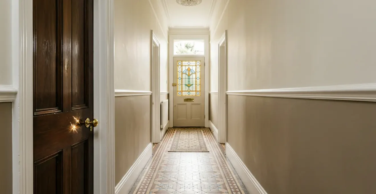
The long, narrow hallway is a defining characteristic of the Victorian terraced house. With its high ceilings, intricate corbels, and potential for beautiful encaustic tiles, it is an architectural feature of immense character. Yet, as any owner knows, it can also be a tunnel of perpetual gloom, a space that feels more like a functional corridor than a welcoming entrance. The default advice is often blunt and generic: paint everything brilliant white, install a vast mirror, and flood it with harsh modern lighting. This approach can achieve brightness, but often at the cost of the very soul of the home, creating a sterile environment that feels disconnected from its history.
The challenge lies in the inherent tension between modern living’s desire for light and the architectural integrity of a period property. Many well-intentioned efforts fail because they treat the symptoms—the darkness—without understanding the cause, which is often a combination of poor light quality, light-absorbing surfaces, and a misunderstanding of how historical colours work. But what if the true key to a luminous foyer was not to erase its period details, but to make them the heroes of the space? What if the secret lies in mastering the subtle interplay of light, colour, and texture to enhance the hallway’s inherent drama?
This guide moves beyond the platitudes. We will explore how to make informed decisions that respect your home’s heritage while creating a bright, inviting, and functional entryway. By focusing on the quality of light, the properties of authentic materials, and the strategic use of space, you can transform your dark hallway into a stunning overture to your home, proving that historical character and brightness can, and should, coexist beautifully.
To guide you through this transformation, we will explore the critical elements one by one, from the ground up. This structured approach will provide a clear roadmap for making choices that are both aesthetically pleasing and historically sensitive.
Summary: A Specialist’s Guide to Illuminating Your Victorian Hallway
- Encaustic Tiles vs. Hardwood: Which Is Better for Wet Mudrooms?
- Why Your Standard Pendant Light Looks Tiny in a High-Ceiling Hallway
- How to Add Shoe Storage to a Narrow Hallway Without Blocking the Path?
- The Paint Color Mistake That Makes Narrow Hallways Feel Claustrophobic
- When to Refinish Antique Door Hardware Instead of Replacing It
- How Low Should You Hang Industrial Pendants Over a Kitchen Island?
- Chunky Loop vs. Flatweave: Which Jute Style Lasts Longer in Hallways?
- How to Design a Kitchen With Hidden Appliances for a Minimalist Look?
Encaustic Tiles vs. Hardwood: Which Is Better for Wet Mudrooms?
The floor is the foundation of your hallway’s design and its largest single surface, making its material choice critical for both light and practicality. While polished hardwood can lend warmth, original or reproduction encaustic tiles are often the superior choice for a Victorian entrance. Their geometric patterns were a hallmark of the era, with production reaching a staggering 600,000 tiles annually in Britain by the 1920s, cementing their place as the authentic option. Beyond historical accuracy, their satin or semi-gloss finish provides a gentle, light-reflecting surface that is far more effective at bouncing light than a dark-stained wood floor.
From a practical standpoint, a Victorian foyer doubles as a mudroom. Encaustic tiles are exceptionally hard-wearing and resistant to the water, mud, and grit that come with daily life. Unlike hardwood, which can warp, stain, or scratch under such duress, properly sealed tiles are impervious to moisture and easy to clean. Their patterned nature is also incredibly forgiving, skillfully hiding minor scuffs and dirt between cleanings. Choosing a pattern with a significant amount of cream, off-white, or pale yellow in its design will maximize light reflection while maintaining that essential period character.
If you are lucky enough to have original tiles, preserving them is paramount. If they are hidden under layers of paint or carpet, a professional restoration can reveal their former glory. For new installations, a wide range of reproduction tiles are available that capture the spirit of the originals perfectly. This choice is an investment in both the durability and the historical integrity of your home’s most important thoroughfare.
Why Your Standard Pendant Light Looks Tiny in a High-Ceiling Hallway
In a Victorian hallway, with its characteristically high ceilings, lighting is not merely functional; it is sculptural. A common mistake is selecting a pendant light that is woefully undersized. A standard, off-the-shelf fixture that looks adequate in a modern home will be dwarfed by the vertical proportions of a period entrance, appearing lost and insignificant. The key is to choose a fixture with sufficient scale and visual weight to command the space. This doesn’t necessarily mean ornate; a simple, large-scale glass globe or a multi-armed brass fitting can provide the necessary presence while casting a wide, welcoming pool of light.
However, the brightness of your hallway depends on more than just the size of the fixture; it depends on the quality of the light itself. This is where the Color Rendering Index (CRI) becomes crucial. CRI measures a light source’s ability to reveal the true colors of objects. For a period home with its nuanced, heritage paint colors and rich materials, lighting experts recommend a CRI of 90 or above. A low-CRI bulb will make even the most beautiful Farrow & Ball paint look flat and muddy, whereas a high-CRI bulb will bring out its complex undertones and make the entire space feel richer and more vibrant.
This close-up of a vintage-style LED bulb shows how warm, high-quality light reveals the rich tones and textures of period details, something a standard bulb simply cannot do.
When selecting your bulb, also pay attention to color temperature. A warm white light (around 2700K) will create a welcoming, cosy glow that complements the age of the property, avoiding the sterile, clinical feel of cooler daylight bulbs. The right light doesn’t just illuminate; it enhances and celebrates every detail.
How to Add Shoe Storage to a Narrow Hallway Without Blocking the Path?
Clutter is the enemy of light and space, and in a narrow Victorian hallway, shoes are the primary culprit. The challenge is to introduce effective storage without creating an obstacle course that makes the corridor feel even more constricted. The solution lies in thinking vertically and embracing shallow-depth designs. Avoid freestanding shoe racks that jut out into the walkway and instead opt for wall-mounted solutions that maintain a clear path.
Professional organizers often recommend this approach for tight spaces. As Lizzie Grant of Declutter on Demand advises in an article for Real Homes, a national professional organizing service:
Skinny storage in narrow hallways is best to give the impression of space. Try a shoe storage cabinet where shoes can be stored vertically rather than horizontally.
– Lizzie Grant, Declutter on Demand
This principle is perfectly embodied by slimline, tip-out shoe cabinets. These units are often only 15-20cm deep, taking up minimal floor space, and can be painted the same colour as the wall to visually disappear. Placing a narrow shelf or a piece of artwork above them helps draw the eye upward, further enhancing the sense of height and space.
Case Study: A Narrow Victorian Hallway Transformation
A family home in London, featured on the blog Apartment Apothecary, suffered from a hallway that was only as wide as the front door, leading to constant frustration. The solution focused on a combination of vertical and slimline storage. They installed shallow IKEA TRONES wall-mounted shoe cabinets, which consumed negligible floor space. This was paired with a very narrow storage bench from MADE that fit perfectly into the corridor, providing a place to sit and remove shoes without blocking passage. This simple, affordable solution transformed the hallway’s daily function while preserving its period character and maintaining a clear, uncluttered path.
The Paint Color Mistake That Makes Narrow Hallways Feel Claustrophobic
The most common piece of advice for brightening a dark space is to paint it brilliant white. In a north-facing Victorian hallway, this can be a disastrous mistake. North-facing rooms receive cool, blue-toned light throughout the day. A stark, brilliant white paint has no warm pigments to counteract this coolness and will simply reflect the blue tones back, resulting in a space that feels cold, drab, and unwelcoming. The hallway will appear brighter, but also starker and more claustrophobic.
The secret is to choose colours with the correct undertones. For a dark, north-facing hall, you should opt for whites, creams, or pale neutrals that have a yellow, pink, or reddish base. These warm undertones will work to counteract the cool natural light, creating a space that feels luminous, soft, and inviting. Colours with a green or grey base can be beautiful but are often better suited to south-facing rooms where the warm sunlight will balance their inherent coolness.
This is a core principle of period interior design, as experts from heritage paint companies frequently explain. The design team at Farrow & Ball puts it best in their official guidance on how light affects colour:
Northern light tends to bring out the cooler tones within a colour, so if you’re using a lighter tone, avoid anything with a blue or grey base.
– Farrow & Ball Design Team, Farrow & Ball Design Guide
Before committing, always test large sample patches on your walls. Observe how the colour changes throughout the day, from the cool morning light to the artificial light in the evening. This small step is the single most important action you can take to avoid a costly and disappointing colour mistake and ensure your hallway feels both bright and welcoming.
When to Refinish Antique Door Hardware Instead of Replacing It
In the quest for a brighter hallway, small details can have a surprisingly large impact. Door handles, letter plates, and light switches are the tactile points of contact within the space. The modern trend often leans towards replacing original hardware with contemporary matte black or satin nickel finishes. While sleek, these materials absorb light and can look jarringly anachronistic against a period door. The far superior option is to celebrate and restore the original hardware.
Victorian homes were typically fitted with hardware made of solid brass or nickel. Over a century, this hardware develops a unique patina—a soft, deep lustre that cannot be replicated. Rather than stripping this character away, the goal should be to clean and gently polish it. A well-polished brass doorknob does more than just open a door; it acts like a piece of jewellery for the space. Its warm, reflective surface will catch and bounce ambient light around the corridor, adding small, shimmering points of interest that contribute to an overall sense of brightness.
This beautifully restored Victorian brass handle demonstrates how a polished, period-appropriate material can catch and reflect warm light, adding a subtle sparkle that matte finishes cannot achieve.
Refinishing is almost always preferable to replacing, provided the hardware is original and functional. It is not only more cost-effective but also preserves the irreplaceable history and craftsmanship of the home. If original pieces are missing or broken, seek out reclaimed items from architectural salvage yards or choose high-quality, unlacquered brass reproductions that will develop their own beautiful patina over time. This commitment to authenticity will lend a depth and warmth to your hallway that new, mass-produced items simply cannot match.
How Low Should You Hang Industrial Pendants Over a Kitchen Island?
While the title references a kitchen, the principles of hanging a pendant light correctly are universal and especially critical in a hallway, where clearance and sightlines are paramount. Hanging a fixture at the wrong height can either block views or fail to illuminate the space effectively. In a Victorian hallway, getting this right ensures both safety and aesthetic harmony. The height must be determined by the ceiling height, the fixture’s design, and the people who live in the house.
The primary rule is safety and comfort. You must ensure that no one, particularly the tallest member of the household, will hit their head on the fixture. This is especially important in a thoroughfare like a hallway. Furthermore, the light should not obstruct key sightlines, for instance, the view from the front door down the hall or the view from the top of the stairs. A visually “heavy” or solid fixture may need to be hung higher than a delicate glass or wireframe one to avoid overwhelming the narrow space.
Ultimately, the perfect height balances clearance, illumination, and visual appeal, making the light a feature, not an obstacle. Following a clear set of guidelines can prevent common installation errors.
Checklist for Correct Foyer Pendant Height
- Ensure the bottom of the fixture is at a minimum of 7 feet (2.1 meters) from the floor to avoid head-bumping.
- Hang the fixture higher if it is in a direct sightline from the top of the stairs or an upper landing to keep views clear.
- For visually ‘heavy’ solid metal pendants, maintain greater clearance than for ‘light’ glass or wireframe designs to avoid a top-heavy feel.
- In narrow foyers, consider the visual weight of the fixture relative to the space to avoid overwhelming the corridor.
- Always test the height by having the tallest household member walk beneath it before final installation.
Chunky Loop vs. Flatweave: Which Jute Style Lasts Longer in Hallways?
A runner is an essential element for adding warmth, texture, and colour to a long hallway. It also plays a crucial role in managing light. While natural fibres like jute or sisal are popular for their durability and timeless appeal, the style of the weave has a significant impact on both longevity and light reflection in a high-traffic area. The two primary options are a chunky loop pile and a tight flatweave.
For a narrow, dark hallway, a flatweave runner is unequivocally the better choice. Chunky, high-pile rugs, while cosy underfoot, have a matte texture that tends to absorb light, which can make a dark space feel even darker. Furthermore, their prominent loops are prone to snagging, especially with pets’ claws or heeled shoes, and they can trap dirt more easily, making them less practical for an entryway. A flatweave, by contrast, has a lower profile and a smoother surface.
This smoother surface often has a subtle sheen that reflects ambient light down the length of the corridor, subtly contributing to the overall brightness. This is a point often emphasized by design professionals. As one interior design expert notes in an analysis for The Nordroom:
A flatweave runner, especially one with a subtle sheen or a light pattern, will reflect more ambient light down a narrow corridor than a chunky, matte loop pile which absorbs light.
– Interior Design Expert, Design Analysis for Period Properties
In terms of durability, the tight construction of a flatweave makes it more resilient to the constant footfall of a hallway. Look for a dense weave and consider materials blended with wool for added softness and resilience. A light-coloured or subtly patterned flatweave runner is a functional and beautiful workhorse that will brighten your hallway and stand the test of time.
Key takeaways
- Light quality (a high CRI of 90+) is more important for revealing true colour and creating warmth than sheer, overwhelming brightness.
- The undertone of your paint is critical. Use warm-based whites and neutrals in north-facing halls to counteract cool natural light.
- Material finish dictates light reflection. Polished metals, satin paints, and flatweave rugs reflect light, while matte textures absorb it.
How to Design a Kitchen With Hidden Appliances for a Minimalist Look?
Though the title refers to a kitchen, its core principle—achieving a clean, minimalist look by “hiding” functional items—is directly applicable to creating a serene and orderly Victorian foyer. The goal is not to strip the space of its character in pursuit of minimalism, but to achieve a state of purposeful calm. This means designing a space where the “appliances” of daily life—shoes, coats, keys, and mail—are thoughtfully concealed, allowing the period architecture to take centre stage.
This concept is the culmination of the strategies we’ve discussed. It is about integrating slim, vertical storage that blends into the walls, as we saw with wall-mounted shoe cabinets. It involves choosing furniture, like a narrow console table or bench with built-in storage, that is perfectly scaled to the space. It means creating designated, non-visible homes for everyday clutter. A beautiful brass bowl on a console table for keys, or an elegant wall-mounted letter holder, keeps items organized without creating visual noise.
By thoughtfully concealing the functional chaos of an entryway, you create a powerful first impression. The eye is no longer drawn to a pile of shoes or a heap of coats, but is free to appreciate the soaring ceiling, the intricate plasterwork, and the beautiful glow from a well-chosen pendant. This is not the cold minimalism of modern design, but a historically-sensitive approach that uses order and clarity to amplify, rather than diminish, the home’s inherent character. It’s the art of making the practical invisible, so the beautiful can shine.
Begin today by auditing your hallway’s light, colours, and materials. By applying these principles, you can take the first step towards creating an entrance that is not only bright and functional but also a deeply authentic and welcoming reflection of your home’s unique history.