The frustration of a home feeling like a collection of disconnected spaces, despite beautiful individual rooms, stems from a lack of visual flow. The solution lies not in simply matching colors but in mastering a deeper architectural concept: spatial rhythm. This involves creating a deliberate visual journey through your home, using foundational elements like color and flooring as a canvas, and architectural details like trim and lighting to guide the eye and unify disparate areas into a cohesive, harmonious whole.
For many homeowners, the renovation journey ends with a collection of beautifully designed but fundamentally disconnected rooms. The living area feels like one world, the kitchen another. This disjointedness is a common source of frustration, turning a dream home into a series of isolated vignettes rather than a unified sanctuary. The standard advice often revolves around creating a strict color palette or repeating materials, but these are merely surface-level tactics. They can lead to a home that feels repetitive and sterile, not truly fluid.
The core issue is a misunderstanding of what creates flow. It is not about monotonous repetition. It is about establishing a visual rhythm—a pattern of anchor points and connecting threads that guide the eye and the body through a space with effortless grace. True spatial fluidity is an architectural art form. It’s about treating the transitions between rooms not as problems to be solved with ugly threshold strips, but as intentional design moments that contribute to the home’s overall narrative.
This is where we move beyond decoration and into spatial architecture. To achieve that coveted seamlessness, you must think like an architect, considering the home as a single, integrated volume. The key is not to make every room look the same, but to ensure they speak the same visual language. This guide will deconstruct this process, revealing the principles to transform your multi-story house from a series of separate zones into one continuous, flowing experience.
This article will guide you through the essential architectural strategies to establish that seamless flow. We will explore everything from the psychological power of a unified color base to the structural considerations that can make or break your entire vision.
Summary: Mastering Cohesive Design in Your Home
- Why Does Using One Paint Color Make Small Homes Feel 30% Bigger?
- How to Transition Flooring Between Rooms Without Ugly Threshold Strips?
- Open Plan vs. Broken Plan: Which Layout Suits Families With Young Kids?
- The Styling Mistake That Makes Expensive Renovations Look Cheap
- How to Use Molding and Trim to Unify Mismatched Ceiling Heights
- The Lighting Error That Leaves the Center of Your Room in Shadow
- The Structural Mistake That Can Collapse Your Renovation Budget
- How to Distinguish Future Classics From Fast Furniture Fads?
Why Does Using One Paint Color Make Small Homes Feel 30% Bigger?
The idea that a single paint color can dramatically expand the perception of space is not an illusion; it is a principle rooted in visual psychology. When the eye can travel uninterrupted across walls, through doorways, and into the next room without being stopped by a jarring change in color, the brain perceives the combined areas as one larger, continuous volume. This technique removes visual boundaries, effectively erasing the corners and thresholds that mentally segment a home. The effect is an immediate sense of openness and airiness.
The choice of color further amplifies this effect. As research in visual psychology demonstrates, cool colors like muted blues, soft grays, and off-whites tend to recede. They make walls feel further away, enhancing the feeling of spaciousness. This doesn’t mean your home must be devoid of color. The strategy is to establish a dominant neutral foundation and then introduce variance through a structured approach like the classic 60-30-10 rule. Your single, unifying color makes up 60% of the space (the walls), a secondary color or texture (like upholstery or curtains) accounts for 30%, and vibrant accents (art, pillows) provide the final 10%.
This creates a sophisticated and cohesive palette without sacrificing personality. The single background color acts as the foundational canvas, ensuring that even as you move between a living room with blue accents and a kitchen with green ones, the underlying visual language remains consistent. The flow is preserved, and the space feels both expansive and thoughtfully curated.
How to Transition Flooring Between Rooms Without Ugly Threshold Strips?
The floor is the second great visual plane of your home, and how you handle its transitions is a defining mark of sophisticated design. The clunky, raised threshold strip is a relic of necessity, not a feature of intentional design. It signals a visual and physical stop, shattering the very flow you aim to create. The architectural approach is to treat this junction as a design opportunity—an “intentional transition” that is either seamlessly invisible or a beautiful detail in its own right.
For a truly seamless look between hard surfaces like wood and tile, the goal is a flush transition. This can be achieved in several elegant ways:
- The Clean Metal Inlay: A thin, flush strip of brass, steel, or aluminum set between two flooring materials creates a deliberate and refined border. It acknowledges the change in material while maintaining a perfectly level plane, turning the transition into a crisp, architectural line.
- The Interlocking Pattern: Instead of a hard line, allow one material to bleed into the other. A popular method is to use hexagonal tiles that interlock with straight wood planks, creating an organic, visually engaging transition that guides the eye naturally from one space to the next.
- Material-Matched Strips: Use a flush T-strip made from the same material as the wood flooring. While still a strip, being flush and color-matched makes it far less obtrusive than a contrasting metal or vinyl piece.
This close-up detail shows how a simple brass inlay can elevate a necessary transition into a powerful design statement, creating a deliberate moment of beauty where two materials meet.
The key is precision installation and a commitment to maintaining a level surface. When the floor flows uninterrupted, the sense of one continuous space is profoundly reinforced. You are no longer stepping *over* a barrier between rooms; you are simply moving through a unified environment.
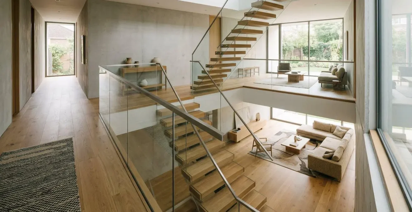
Open Plan vs. Broken Plan: Which Layout Suits Families With Young Kids?
For decades, the open-plan layout has been championed as the ultimate ideal for modern family living. By removing all interior walls between the kitchen, living, and dining areas, it promises boundless light and togetherness. However, for families with young children, this complete lack of separation can create challenges: noise travels freely, messes are always in view, and creating a quiet zone for homework or a nap is nearly impossible. This is where the “broken-plan” layout emerges as a more nuanced and practical solution.
A broken plan retains the airy, connected feeling of an open concept but uses clever architectural devices to create distinct “zones” that can be separated or connected as needed. It offers the best of both worlds: togetherness when you want it and privacy when you need it. This is achieved through elements like:
- Pocket Doors: Large doors that slide discreetly into the walls can close off a kitchen from a living area during messy meal prep or open up for entertaining.
- Half-Walls or Built-in Bookshelves: These create a sense of separation and provide functional storage without completely blocking light or sightlines.
- Changes in Floor Level: Stepping down one or two steps into a living area can psychologically define it as a separate, cozier space.
- Glazed Partitions: Crittall-style glass and steel walls can divide a space acoustically while maintaining full visual connection.
Case Study: The Hampshire Home’s Flexible Family Space
As detailed in a project by Snug Architects, a home in Hampshire was designed with a broken-plan layout to give a family maximum flexibility. By incorporating multiple large pocket doors between the kitchen, dining, and living zones, the homeowners can instantly transform their space. They can create one large, flowing area for parties, or close off the living room to create a quiet space for the kids to play while adults converse in the kitchen, all without sacrificing the home’s open and connected feel.
This approach directly addresses the common desire to make an open concept feel cozier. By creating these soft divisions, the broken plan provides the intimacy and functionality of separate rooms within a larger, unified spatial flow.
The Styling Mistake That Makes Expensive Renovations Look Cheap
You have invested in high-end materials, custom cabinetry, and the perfect layout. Yet, something feels off. The space, despite its costly components, lacks sophistication and feels cluttered. This common pitfall is the result of a single styling mistake: a lack of visual hierarchy. This often manifests as “overdecorating,” where every surface is adorned and every object competes for attention. Without a clear focal point, the eye doesn’t know where to rest, and the result is visual chaos, not cohesive elegance.
True luxury in design is about restraint and intention. It’s about making deliberate choices about what to highlight and what should recede into the background. A room with a clear visual hierarchy feels calm, confident, and harmonious. Instead of filling every shelf and covering every wall, an architect would advise you to edit ruthlessly. Select one or two hero elements—a stunning piece of art, a sculptural fireplace, a dramatic light fixture—and let them be the stars. All other elements should play a supporting role.
This disciplined approach not only creates a more serene and sophisticated environment but also has a tangible financial impact. A home with a strong, cohesive design narrative is perceived as more valuable. In fact, some studies show that a thoughtfully unified interior can result in a 15% increase in property value. The mistake is thinking that more “stuff” equals more style. The reality is that negative space—the empty areas—is just as important as the objects themselves. It gives your feature pieces room to breathe and allows the overall design to feel curated and intentional, not accidental and cheap.
How to Use Molding and Trim to Unify Mismatched Ceiling Heights
One of the most challenging aspects of creating flow in older homes or multi-story additions is dealing with inconsistent ceiling heights. A sudden drop or rise in the ceiling from one room to the next can create a jarring visual break. The conventional solution might be to ignore it, but the architectural solution is to use trim and molding to create a powerful unifying element known as a “datum line.”
A datum line is a continuous, strong horizontal line that runs through adjacent spaces at a consistent height. This line tricks the eye. Instead of focusing on the mismatched ceilings, the eye follows the uninterrupted path of the datum line, perceiving the spaces as visually connected and harmonious. This is one of the most effective and elegant tools for imposing order on architectural inconsistencies. You can establish a datum line in several ways:
- Picture Rail Molding: Installing a picture rail at a consistent height (e.g., 8 feet) through all connected rooms creates a strong, purposeful line. Everything above the rail can be painted the same color as the ceiling, further minimizing the perception of height differences.
- Chair Rail: In more traditional homes, a chair rail can serve the same purpose, providing a continuous horizontal axis that connects rooms.
- Painting a Color Block: A more modern approach is to paint the lower portion of the walls in one color and the upper portion (above the imaginary datum line) in another, carrying this two-tone scheme throughout the home.
This image perfectly illustrates the concept. The consistent picture rail molding acts as a visual anchor, creating a seamless transition and overriding the noticeable difference in ceiling heights between the two rooms.
The key is consistency. The datum line must maintain its height perfectly as it moves from room to room. This single detail can stitch together a disjointed floor plan, proving that thoughtful architectural elements are the true secret to creating seamless flow.
The Lighting Error That Leaves the Center of Your Room in Shadow
Lighting is the invisible layer of design that dictates the mood and functionality of a space, yet it is often an afterthought. The single most common lighting error is relying exclusively on a grid of recessed downlights. This approach, often called the “Swiss cheese ceiling,” creates pools of harsh, downward-facing light around the perimeter of a room while leaving the center and vertical surfaces in relative shadow. It flattens textures, creates unflattering shadows on people, and fails to create any sense of warmth or intimacy.
To create a room that is both beautifully illuminated and highly functional, you must think in layers. A professional lighting scheme is composed of three distinct types of light working in harmony:
- Ambient Lighting: This is the general, overall illumination that makes a space navigable. This can come from a central ceiling fixture, cove lighting that washes the ceiling, or yes, a well-spaced and dimmable set of downlights. Its job is to provide the foundational canvas of light.
- Task Lighting: This is focused, functional light directed where it’s needed for specific activities. Examples include under-cabinet lighting in the kitchen for food prep, a reading lamp beside a chair, or pendants over a dining table. Task lighting is the workhorse of your lighting plan.
- Accent Lighting: This is the strategic, dramatic light that creates visual interest and hierarchy. It’s used to highlight architectural features, artwork, or textural walls. Picture lights, uplights behind plants, or a spotlight on a fireplace are all forms of accent lighting. It tells the eye what is important.
By layering these three types, you create a rich, dynamic, and adaptable environment. You can use only the accent and task lighting for a cozy, intimate evening, or turn on all the layers for a bright, energetic gathering. This layered approach eliminates dark spots, adds depth and dimension to your space, and is essential for achieving a truly high-end, cohesive feel throughout the home.
The Structural Mistake That Can Collapse Your Renovation Budget
In the pursuit of open-plan living and seamless flow, the most seductive idea is often to “just take down that wall.” This is also, by far, the most dangerous assumption a homeowner can make and the single biggest structural mistake that can decimate a renovation budget. The wall you see is only the surface; what lies within and what it supports is a complex and potentially costly unknown. Assuming that wall removal is a simple act of demolition is a recipe for financial disaster.
The costs spiral when that wall turns out to be more than just drywall and studs. There are two primary culprits for budget collapse: load-bearing walls and “wet” walls. A load-bearing wall supports the weight of the floor or roof above it. Removing it without installing an appropriately sized beam or header can compromise the structural integrity of your entire home. The process involves engineering calculations, expensive materials (like LVL beams), and significant labor. A “wet” wall contains plumbing stacks, water supply lines, or HVAC vents. Rerouting these systems is a complex and expensive job requiring licensed plumbers and HVAC technicians.
Even if the wall is non-load-bearing, you must budget for the “stitch-up” costs: patching the ceiling and adjacent walls, and, crucially, lacing in new flooring to fill the gap where the wall once stood. These hidden costs can easily add thousands of dollars to a project that was underestimated from the start. To avoid this catastrophic budget failure, a rigorous pre-renovation process is non-negotiable.
Your Action Plan: Budget Protection Strategies for Structural Changes
- Initial Assessment: Hire a licensed contractor or structural engineer to definitively identify all load-bearing walls before any design work begins.
- Thorough Inspection: Conduct pre-renovation inspections to uncover hidden electrical, plumbing, or structural issues that will need to be addressed.
- Contingency Fund: Include a contingency fund of at least 15-20% of your total budget specifically to manage unforeseen structural costs and rerouting of services.
- Permitting and Codes: Work with professionals who understand local building codes and will secure all necessary permits before demolition starts to avoid fines and work stoppages.
- All-In Budgeting: Demand a quote that includes the complete “stitch-up” cost, including drywall patching, flooring integration, and repainting, not just the demolition and beam installation.
Key Takeaways
- True spatial flow comes from creating a “visual rhythm,” not just matching colors. It’s about guiding the eye intentionally through the home.
- Establish a continuous canvas with a unified primary color and flooring, treating transitions not as problems but as deliberate design moments.
- Use architectural elements like a “datum line” of trim to impose order and unify spaces with inconsistencies like mismatched ceiling heights.
- Layer your lighting (ambient, task, accent) to create depth and functionality, avoiding the common error of relying only on downlights.
How to Distinguish Future Classics From Fast Furniture Fads?
The final layer in creating a seamless home is the furniture. The pieces you choose can either reinforce the timeless, flowing aesthetic you’ve worked so hard to build or shatter it with trendy, disposable items that will feel dated in a few years. Distinguishing a future classic from a fleeting fad is a critical skill for a lasting design. The difference lies in a focus on three core principles: timeless form, quality materials, and functional integrity.
Future classics possess a silhouette that is not tied to a specific decade. Think of an Eames lounge chair, a Florence Knoll sofa, or a simple parsons table. Their clean lines and balanced proportions make them stylistically versatile. They are defined by their craftsmanship and the honesty of their materials—solid wood, genuine leather, hand-welded steel. A fad, by contrast, is often defined by a trendy (and soon-to-be-dated) color, an exaggerated shape, or inferior materials like particleboard and polyester designed to mimic a high-end look for a season. As the team at WiC Project notes, ” Choosing classic materials, balanced color palettes, and functional layouts usually creates a longer-lasting design.”
The most strategic approach is to invest in classic, neutral “anchor” pieces for your largest items like sofas and dining tables. These are the workhorses of your home that need to stand the test of time. You can then indulge in trends in a smaller, more affordable, and easily replaceable way.
Interior designers consistently advise against buying ultra-trendy sofas, $3,000 trendy rugs, or trendy coffee tables that will be out of style in a few months to years… Instead, they recommend opting for larger pieces you can see yourself using for years to come, and investing in trendy decorative accents like throw pillows, candles, and vases that can be easily updated.
– Havenly, Designer Advice on Avoiding Trendy Furniture Mistakes
This method ensures your home’s foundational flow is supported by enduring quality, while still allowing you to express your personality and play with current styles in a low-risk, high-impact way.
By integrating these architectural principles—from the broad canvas of your walls to the specific forms of your furniture—you move beyond simple decoration. You begin to sculpt space, orchestrate a visual journey, and create a home that is not just a collection of rooms, but a single, harmonious experience. To truly bring these principles to life, the next logical step is to begin mapping your home’s unique sightlines and identifying your primary visual anchors to build your cohesive narrative upon.