Successfully mixing metal lighting fixtures isn’t about following a simple color rule; it’s about mastering a hierarchy of finish, function, and light.
- The properties of a finish (matte vs. gloss) dictate how it absorbs or reflects light, fundamentally changing a room’s atmosphere.
- The right light bulb color temperature (Kelvin) can either enhance the warmth of brass or highlight the crispness of chrome.
Recommendation: Instead of choosing a dominant color, select a dominant texture (like matte) and use different metal colors as accents, ensuring their sheen and function are complementary within the space.
The question of how to mix metal finishes—particularly matte black, brass, and chrome—can paralyze even the most enthusiastic home decorator. Common advice often suggests picking one dominant metal and using others as accents, but this simplistic rule fails to explain why some combinations feel effortlessly chic while others look like a chaotic mistake. The fear of clashing fixtures leads many to default to a single finish, missing the opportunity to create a room with depth, character, and a sophisticated industrial edge.
The secret doesn’t lie in an arbitrary color ratio. It’s found in understanding the physics of light, the hierarchy of texture, and the visual story your fixtures tell together. The goal isn’t just to place different metals in a room; it’s to orchestrate a deliberate dialogue between them. This involves considering how a matte surface absorbs light versus how a polished one reflects it, how a fixture’s shape interacts with a room’s architecture, and how different materials can be chosen to age gracefully together, developing a cohesive patina over time.
This guide abandons vague aesthetic advice for a cohesive, rule-based framework. We will explore the functional properties of different finishes, from light absorption and maintenance to the critical role of bulb temperature. By mastering these principles, you will move beyond simply choosing fixtures to confidently curating a layered and intentional lighting scheme that feels both modern and timeless.
To navigate this complex topic, we have structured this guide to build your expertise from the ground up, starting with the properties of a single finish and expanding to the interplay between multiple materials and light sources.
Contents: A Rule-Based Guide to Mixing Metal Fixtures
- Why Matte Black Lampshades Provide Less Ambient Light Than Glossy Ones
- The Cleaning Mistake That Ruins the Matte Finish on Light Fixtures
- Linear or Cluster: Which Matte Fixture Suits a Rectangular Dining Table?
- Warm vs. Cool Bulbs: Which Looks Best With Matte Black Fixtures?
- How Low Should You Hang Industrial Pendants Over a Kitchen Island?
- Do You Need Special Wiring for Tunable White LED Strips?
- Matte or Gloss: Which Finish Suits Victorian Plasterwork Best?
- How to Protect a Reclaimed Wood Table From Water Rings and Stains?
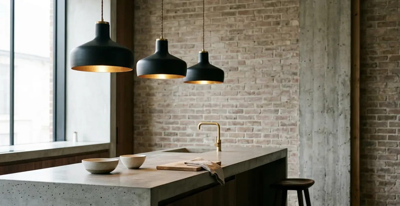
Why Matte Black Lampshades Provide Less Ambient Light Than Glossy Ones
The choice between a matte and glossy finish is more than an aesthetic preference; it’s a decision that directly controls the physics of light in your room. A matte black finish possesses a micro-textured surface that diffuses incoming light rays in multiple directions, effectively absorbing them rather than bouncing them back. This is why black absorbs light rather than reflecting it, a principle that has a profound impact on a room’s overall brightness.
A matte black lampshade acts as a light control tool. It prevents light from escaping through the shade itself, forcing it downwards and upwards in a more focused beam. This creates dramatic pools of task lighting ideal for a dining table or kitchen island, but it significantly reduces the soft, room-filling ambient light. In contrast, a glossy white or light-colored shade reflects light both internally and externally, contributing to a brighter, more open feel. Understanding this functional difference is the first step in building a layered lighting plan.
This effect can be strategically manipulated. Many modern fixtures pair a matte black exterior with a reflective gold or copper interior. As seen in the image, this design embraces the light-absorbing quality of the matte exterior to prevent glare while using the polished interior to cast a warm, rich, and directed glow downwards. This creates intimacy and drama, proving that the finish’s function is as important as its color.
The Cleaning Mistake That Ruins the Matte Finish on Light Fixtures
A matte finish exudes understated sophistication, but its microscopic texture makes it vulnerable to improper cleaning. The most common and damaging mistake is using abrasive or chemical-based cleaners. While effective on other surfaces, these products can permanently ruin a matte powder-coated or painted fixture. Abrasives like scouring pads create micro-scratches that catch light, resulting in an uneven, patchy sheen. Harsh solvents, on the other hand, chemically strip the top layer of the finish.
As the experts at Best Damn Powder Coating explain, the wrong product does more than just clean:
Commercial cleaning solutions have their place. Solvents and petroleum-based cleaning products are very effective at removing dirt and grease from surfaces. They are not the right choice for powder coated surfaces, however. These types of cleaners will remove dirt, but they also remove layers of the finish from the surface of the object they are cleaning.
– Best Damn Powder Coating, Care & Maintenance Guide
The correct method is gentle and consistent. Regular dusting with a soft microfiber cloth or compressed air for intricate parts prevents dirt buildup. For more thorough cleaning, a simple solution of warm water and a small amount of pH-neutral soap is all that’s needed. It’s also critical to protect matte finishes from the products used on adjacent metals. When polishing a brass faucet, for example, cover any nearby matte black pendants to avoid splatter, which can stain the finish.
Linear or Cluster: Which Matte Fixture Suits a Rectangular Dining Table?
Once you’ve chosen your finish, the next decision is form. Over a rectangular dining table, the choice between a single linear fixture and a cluster of individual pendants creates two distinct design narratives. A linear fixture, with its strong horizontal line, reinforces the geometry of the table and the room, lending a structured, architectural feel. It provides even, functional light across the entire surface, making it ideal for multi-purpose tables used for dining, work, and projects.
A cluster of pendants, by contrast, introduces a sense of organic, dynamic energy. It breaks up the rigid lines of the table, creating a more playful and artistic focal point. This arrangement is less about uniform illumination and more about creating atmosphere. The resulting pools of light foster intimacy and define the dining zone within a larger open-plan space. The industrial story also differs: a linear fixture evokes a single, purposeful light from a workshop, while a cluster suggests a curated collection of salvaged individual lights.
The following table, based on an analysis of fixture impact on interiors, breaks down the decision-making process:
| Aspect | Linear Fixture | Cluster Fixture |
|---|---|---|
| Design Intent | Reinforces table geometry – structured, architectural feel | Contrasts with geometry – dynamic, organic look |
| Visual Weight | Significant visual weight, anchors the room | Lighter, more playful visual presence |
| Industrial Story | Evokes factory or workshop aesthetic | Suggests collection of salvaged individual lights |
| Light Distribution | Even, functional light ideal for multi-purpose table | Dramatic ‘pools’ of light, better for atmosphere and defining dining zone |
| Best For | Task-oriented dining, longer islands (7+ feet) | Ambient-focused dining, creating intimate zones |
Ultimately, the choice depends on your priority. If the table is a hub of activity requiring consistent task lighting, the linear fixture is the superior functional choice. If you aim to create a dramatic, ambient-focused dining experience, the cluster offers more creative expression.
Warm vs. Cool Bulbs: Which Looks Best With Matte Black Fixtures?
A matte black fixture is a neutral canvas; the light bulb you choose is the paint. The bulb’s color temperature, measured in Kelvin (K), determines whether your other metal finishes will pop with richness or fall flat. Warm light (2700K-3000K) emits a soft, yellowish glow that dramatically enhances the golden tones in brass and copper. This creates a cozy, intimate atmosphere perfect for living and dining areas. However, this same warm light can make cool metals like chrome and polished nickel appear dull or even slightly yellow.
Conversely, cool light (3500K-4000K) casts a crisp, white-to-bluish light. This is the perfect choice for making chrome, stainless steel, and nickel fixtures look sharp, clean, and modern. The downside is that it can wash out the warmth of brass, making it look less vibrant. When pairing bulbs with matte black, the key is to choose a temperature that complements your *accent* metal. To ensure that your chosen metals are displayed accurately, use bulbs with a high Color Rendering Index (CRI). According to industry standards, light sources with a CRI of 90+ are excellent at rendering the true colors of materials.
As the image demonstrates, a warm Edison-style bulb inside a matte black pendant creates a beautiful synergy with brass hardware. The warm glow amplifies the richness of the brass, creating a cohesive and inviting scene. If the hardware were chrome, a cooler 3500K bulb would be a better choice to bring out its sleek, reflective quality.
How Low Should You Hang Industrial Pendants Over a Kitchen Island?
Properly positioning pendants over a kitchen island is a balancing act between aesthetics, sightlines, and function. While every space is unique, a clear, rule-based starting point exists. Professional lighting designers generally recommend a clearance of 30-36 inches between the bottom of the fixture and the top of the counter. This height is low enough to provide effective task lighting for food prep without obstructing the view across the island for most people.
However, this guideline is just the beginning. Taller family members, high ceilings, or highly reflective countertop materials all require adjustments. For ceilings above the standard 8 feet, a common rule of thumb is to add 3 inches of hanging height for every additional foot of ceiling height. But before you make the final cut, it’s crucial to test the placement in the real world. A simple mock-up using a balloon or cardboard cutout can save you from a costly installation mistake.
To ensure your placement is perfect, run through a series of practical checks before the electrician arrives. These tests account for the human element and material interactions that simple measurements can’t predict.
Your Pre-Installation Height-Check Plan: 5 Key Tests
- The Obstruction Test: Have someone hold the fixture at the proposed height. Sit and stand at the island to confirm it doesn’t block face-to-face conversation or sightlines to other parts of the room.
- The Reflection Test: Place a bright flashlight inside your mock-up. Check for distracting glare spots on polished metal faucets, glossy countertops, or appliance screens. Adjust the height if necessary.
- The Sightline Test: Ask the tallest person in your household to stand and work at the island. Ensure the bottom of the pendants doesn’t interfere with their direct line of sight.
- The Visual Plane Test: Observe how the horizontal line created by the row of pendants interacts with other metal elements, like the top edge of cabinet pulls or appliance handles. Strive for a pleasing alignment.
- The High Ceiling Adjustment: Start with the 30-36 inch rule, then add 3 inches of height for every foot of ceiling over 8 feet to maintain proper scale and proportion.
Do You Need Special Wiring for Tunable White LED Strips?
Tunable white LED technology offers the ultimate control in a mixed-metal environment, but it does require specific wiring compared to standard single-color LEDs. While a standard LED strip has two connection points (positive and negative), a tunable white strip has three or more: one for power, one for the warm white diodes, and one for the cool white diodes. This requires a compatible multi-channel driver and controller, which allows you to blend the warm and cool channels to achieve any color temperature in between.
The installation is more complex, often requiring low-voltage wiring with more conductors, but the payoff for a mixed-metal scheme is immense. As highlighted in an analysis of color temperature’s impact, this technology lets you “activate” different metals throughout the day. You can set the lights to a crisp 4000K during the daytime, making your chrome fixtures and stainless steel appliances appear sharp and modern while you work in the kitchen.
Then, as evening approaches, you can shift the color temperature down to a warm 2700K. This transition brings out the rich, inviting glow of your brass pendants and cabinet pulls, creating a cozy atmosphere for dining or relaxing. This ability to adjust the lighting transforms a static design into a dynamic and responsive environment. It solves the classic dilemma of choosing between warm or cool light by giving you both, ensuring every metal finish in your room gets its moment to shine under ideal conditions.
Matte or Gloss: Which Finish Suits Victorian Plasterwork Best?
When introducing a modern light fixture into a space with historic architectural details like Victorian plasterwork, the goal should be respectful contrast, not mimicry. Trying to match the ornate, detailed nature of the plasterwork with an equally elaborate fixture can create a cluttered, competing look. Instead, a modern matte finish, particularly matte black, creates a powerful and sophisticated dialogue between old and new.
A matte black industrial pendant acts as a clean, sculptural silhouette against the intricate backdrop of a plaster ceiling medallion. Its lack of reflection or sheen allows the texture and three-dimensionality of the historic plasterwork to remain the star, while the fixture asserts its modernity through its simple form and color. A glossy or highly polished chrome fixture, in contrast, would create distracting reflections that could compete with the delicate shadows and highlights of the plaster details.
This principle of contrast extends to mixing multiple metal types in such an environment. As the design blog Room for Tuesday advises, texture is a key tool for creating harmony:
The goal is contrast. You want each finish to stand on its own without feeling mismatched. Design with proximity in mind… leave negative space between metals of different finishes if they compete. Consider the texture of the metal… combine matte, polished, and living finishes to create an interesting and textural look.
– Room for Tuesday Design, Designer Guide to Mixing Metals by Room
In a Victorian setting, this means you could pair a primary matte black pendant with sconces in a soft, brushed brass. The matte finish provides the bold contrast against the plaster, while the brushed finish on the accent pieces adds warmth and a subtle textural layer without the jarring reflections of a fully polished surface.
Key Takeaways
- Mixing metals is a science of balancing light, texture, and function, not just color.
- The finish (matte vs. gloss) and bulb color temperature (Kelvin) are your most powerful tools for controlling how metals appear in a room.
- Create a hierarchy by choosing a dominant texture (like matte) and using different metal colors with complementary sheens as accents.
How to Protect a Reclaimed Wood Table From Water Rings and Stains?
The relationship between your lighting fixtures and your furniture goes beyond mere proximity; it extends to a shared narrative of texture and sheen. When you have a reclaimed wood dining table under your mixed-metal pendants, the choice of wood sealant is a critical design decision that should harmonize with your lighting. The sheen of the protective coat on the wood directly impacts how it pairs with the metals above it. A dead-matte or satin polyurethane finish on the wood will absorb light similarly to your matte black fixtures, creating a cohesive and deeply textural story.
Conversely, a high-gloss lacquer on the table would compete with polished chrome or brass fixtures, creating a cacophony of reflections. The goal is to create balance. As noted by design experts, this principle is fundamental to successful material mixing:
The sheen of your table’s protective coat is a design choice that should harmonize with your metals. A dead-matte finish on the wood pairs beautifully with matte black fixtures, creating a cohesive textural story. Don’t forget about finish sheen when mixing metals – matte balances out shine, and a soft brushed finish balances out a gleaming lacquer.
– Room for Tuesday & Bria Hammel Interiors, Designer Guides to Material Mixing
Furthermore, an approach centered on cohesive patina development suggests that for a truly authentic industrial or rustic aesthetic, materials should be chosen to age together. Using a finishing oil or wax on the reclaimed wood allows it to develop a natural patina over time, perfectly echoing the graceful aging of unlacquered brass or copper fixtures. This creates a living space that evolves with time, rather than a static showroom. The wood’s undertone also plays a key role; warm-toned woods amplify the gold in brass, while cool, ashy woods make matte black appear even starker.
Apply these rule-based principles to your own space, and you will move beyond simply choosing fixtures to confidently orchestrating a cohesive and sophisticated lighting scheme that reflects a deep understanding of material and light.