The secret to a cohesive maximalist room isn’t less stuff, but a stronger visual structure that allows your treasures to converse rather than compete.
- Establish a ‘hero piece’ with strong visual gravitas to anchor the entire design and inform your color palette.
- Adapt the 60-30-10 color rule by considering the dominant ‘color impression’ of complex patterns, not just solid hues.
- Use layered lighting as a sculptural tool to create depth, highlight texture, and prevent the visual flatness that plagues eclectic rooms.
Recommendation: Treat your room like an artistic composition. Every piece should have a deliberate relationship with the others, guided by color, scale, and a unifying narrative.
For the maximalist with a magpie’s eye, the thrill is in the hunt. You’ve collected treasures from different decades, inherited furniture with a story, and fallen for patterns that sing to your soul. But now, assembled in your living room, this collection of beloved objects feels less like a symphony and more like a cacophony. The common advice to “find a common thread” or “mix scales” feels abstract and unhelpful when faced with a Victorian chaise, a mid-century lamp, and a vibrant Kilim rug. The fear of creating a space that looks cluttered, chaotic, or simply messy is real, and it can paralyze the most passionate collector.
This isn’t about curbing your eclectic taste or embracing minimalism. It’s about shifting your perspective from that of a collector to that of a curator. True eclectic mastery isn’t about the items themselves, but about curating the relationships between them. The key isn’t a rigid set of rules, but a more profound understanding of visual composition. Instead of just displaying your treasures, we will explore how to make them converse through principles of visual weight, color harmony, narrative, and the often-overlooked power of light.
This guide provides an organized framework for your artistic impulses. We will deconstruct the process, moving from the foundational anchor of your room to the nuanced details of styling and lighting. You will learn to wield color and pattern with intention, to sculpt space with light, and to keep your composition feeling alive and dynamic. Prepare to transform your collection of beautiful things into a single, cohesive, and deeply personal work of art.
To navigate this curatorial journey, this article breaks down the core principles of creating a harmonious eclectic space. The following sections will guide you through establishing a focal point, mastering color and pattern, and using advanced techniques like lighting and rotation to bring your vision to life.
Summary: How to Mix Patterns and Eras in a Living Room Without It Looking Messy?
- Why You Need a ‘Hero Piece’ to Anchor an Eclectic Room
- The 60-30-10 Color Rule: Does It Work for Eclectic Interiors?
- How to Style a Maximalist Bookshelf That Still Feels Curated?
- The Lighting Mistake That Flattens the Depth of an Eclectic Room
- When to Rotate Your Decor: Keeping an Eclectic Room from Feeling Stagnant
- How to Light Your Yard Without Annoying the Neighbors?
- Geometric or Floral: Which Upholstery Patterns Work With Kilim Rugs?
- How to Seal Exposed Brick Walls to Stop Dust and Crumbling?
Why You Need a ‘Hero Piece’ to Anchor an Eclectic Room
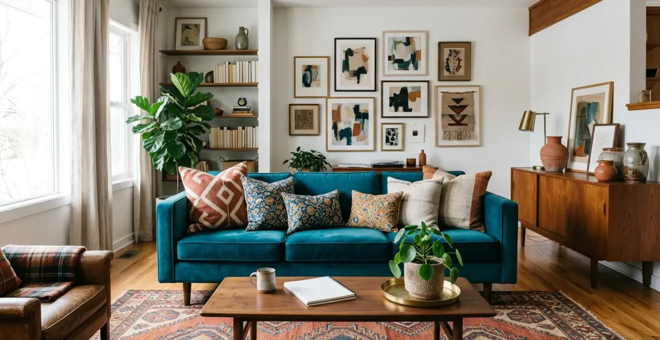
In a room teeming with stories and styles, chaos is the ever-present risk. The single most effective strategy to prevent this is to nominate a ‘hero piece.’ This isn’t necessarily the largest or most expensive item, but the one with the most visual gravitas. It’s the piece your eye lands on first, the object that commands attention and serves as the gravitational center for everything else. This could be a dramatic statement rug, a boldly upholstered sofa, a significant piece of art, or a commanding architectural feature like a fireplace. Without this anchor, all your other beautiful items are just objects floating in space, competing for attention.
Once identified, the hero piece dictates the initial, most important curatorial decisions. As designer Sophie Ashby notes, its role is to unify. In a masterclass on the subject, she explains:
It’s really good to have one fabric in the scheme which ties all of the colors together, so I’m always looking for that hero pattern which combines those five colors.
– Sophie Ashby, Homes & Gardens – Mixing Patterns and Prints Masterclass
This principle extends beyond fabric. Your hero piece becomes the source code for the room’s entire color palette. By extracting three to five hues from your anchor—be it a rug, painting, or textile—you create an inherent, non-negotiable harmony. Every other pattern and solid you introduce, no matter the era or style, will feel intentional because it’s speaking the same color language established by your hero. It provides the foundational logic that gives you the freedom to be wildly creative elsewhere.
The 60-30-10 Color Rule: Does It Work for Eclectic Interiors?
The 60-30-10 rule is a timeless design principle that provides a simple framework for a balanced color scheme: 60% of a room should be a dominant color, 30% a secondary color, and 10% an accent. For a maximalist, this can sound restrictive, but its power lies in its adaptability. The rule is effective because, according to design experts, the 60-30-10 color rule is based on the Golden Section’s pleasing geometric proportions. For an eclectic space filled with complex patterns, the key is to apply it with a curator’s eye, focusing on ‘color impression’ rather than literal color blocks.
Instead of seeing a multi-hued Persian rug as a dozen competing colors, squint your eyes. What is the overall color that comes through? Is it predominantly deep red? That red becomes part of your 60% or 30%. This ‘squint test’ allows you to assign a dominant color impression to your most complex patterns, integrating them seamlessly into the rule. Designers often adapt the formula to a 60-30-10-10 ratio to accommodate a fourth accent, or use it monochromatically—with light, medium, and dark shades of one color—to create depth while mixing wildly different patterns.
This is also where the concept of a ‘bridge color’ becomes invaluable. It’s an accent hue, often from your 10%, that is repeated in small doses across disparate objects to tie them together.
As seen in this detail, a specific terracotta hue can act as a visual thread, appearing in the piping of a cushion, the glaze on a ceramic vase, and the undertones of a wooden chair leg. This subtle repetition creates a sophisticated dialogue between objects of different styles and materials, proving that the 60-30-10 rule, when applied with artistic flexibility, is an eclectic designer’s most powerful tool for creating intentional harmony.
How to Style a Maximalist Bookshelf That Still Feels Curated?
A maximalist bookshelf is a microcosm of the entire living room: a space with the potential for either brilliant curation or overwhelming chaos. The goal is not to stuff every inch, but to create a series of compelling ‘narrative vignettes.’ Think of each shelf as a self-contained composition. To achieve a curated look, start by arranging books with a sense of rhythm, alternating between vertical stacks and horizontal rows. These horizontal stacks then become pedestals for your treasured objects.
The key to avoiding a chaotic look is the strategic use of two principles: grouping and negative space. Arrange objects in odd-numbered groups, typically threes or fives, as these are naturally more appealing to the eye. A classic vignette might consist of one tall item (like a vase), one medium sculptural object, and one small, personal trinket. Repeat materials or a specific accent color in a zig-zag pattern across the shelves to create a visual path for the eye to follow. This repetition makes the collection feel deliberate, not random.
Most importantly, you must embrace negative space as a luxury. Leaving parts of a shelf empty is not a waste; it’s a crucial curatorial choice. This ‘breathing room’ frames your vignettes, allowing each story to be told without being drowned out by its neighbors. It elevates your objects from mere clutter to treasured artifacts, signaling their importance. By stepping back frequently to view the entire unit, you can ensure visual weight is balanced, creating a composition that is rich and full, but also calm and collected.
The Lighting Mistake That Flattens the Depth of an Eclectic Room
You can have the most exquisitely curated collection of furniture and patterns, but if your lighting strategy consists of a single, central overhead fixture, your room will fall flat. This is the single most common mistake in decorating eclectic spaces. As Cecilia Ramos, a senior director at lighting firm Lutron, states, “If you were to paint a room with only one typology of light at a singular intensity, it would feel really flat. You wouldn’t feel depth.” A single light source illuminates everything equally, washing out the textures, colors, and shapes you’ve so carefully assembled.
The solution is to treat light as a sculptural material, using a layered approach to create depth, drama, and intimacy. A well-lit eclectic room requires a minimum of three distinct layers of light, each with a specific job and placed on a separate, dimmable circuit for ultimate control. This three-layer formula, as explained by countless interior design guides, consists of:
- Ambient Light: The foundation. This is your general, room-filling illumination, provided by a central fixture, recessed downlights, or cove lighting. It should be warm (around 2700K) and fully dimmable.
- Task Light: Functional pools of light. These are your floor and table lamps placed next to seating, or sconces for reading. They define zones and make the room navigable and usable.
- Accent Light: The dramatic layer. This is where the magic happens. Use focused spotlights to ‘graze’ a textured brick wall, uplight a tall plant, or use picture lights to make your art pop. This layer creates the highlights and shadows that reveal the three-dimensional quality of your decor.
This layered approach allows you to create distinct ‘pools of light,’ transforming a flat plane into a dynamic environment. The interplay of light and shadow is what gives velvet its sheen, brick its roughness, and a room its soul.
By orchestrating these layers, you move from simply illuminating a space to actively sculpting it. You control the mood, guide the eye, and reveal the rich materiality of your collection, ensuring your eclectic room is as deep and dynamic as the stories it holds. The insight comes directly from a Lutron professional who emphasizes layering light to build a sense of space.
When to Rotate Your Decor: Keeping an Eclectic Room from Feeling Stagnant
For a true collector, the collection is never static. Your living room should reflect this dynamism. Over time, even the most beloved objects can become invisible through a phenomenon known as ‘object blindness.’ When we see the same things in the same places every day, our brain stops processing them, and the room begins to feel stagnant and lifeless. The curatorial solution is rotation—treating your styling as temporary and fluid, rather than a permanent installation.
A seasonal rotation is a powerful way to combat this. It doesn’t mean a complete overhaul, but a strategic swapping of key accent pieces. In spring and summer, you might bring forward lighter textiles like linen, cooler-toned art, and natural objects like shells or coral. As fall and winter arrive, these can be swapped for heavier textures like bouclé and velvet, warmer metallics like brass, and art with deeper, moodier palettes. This approach keeps the room in conversation with the world outside and forces you to re-engage with your collection, seeing old pieces with fresh eyes.
To make this practical, adopt the ‘curator’s closet’ system. This involves designating a storage area for a portion of your collection—a “backstock” of treasures. A good rule of thumb is a 60/40 split: 60% of your decor is on display, while 40% is in rotation, ready to be introduced. This ensures you always have something new to bring into the composition, keeping the narrative of your room constantly evolving.
Your Action Plan: The Curator’s Closet System
- Create a ‘Backstock Closet’: Designate a storage area (a closet, cabinet, or set of bins) for curated items not currently on display. Aim for a 60/40 split—60% displayed, 40% in rotation.
- Plan for Spring (March-May): Swap in lighter textiles (linen, cotton), cooler-toned art (blues, greens), and glass objects. Remove heavy wools and deep jewel tones.
- Curate for Summer (June-August): Emphasize natural found objects (shells, driftwood), woven textures (rattan, jute), and white ceramics.
- Transition to Fall (September-November): Introduce warmer metals (copper, brass), earth-toned art, and heavier textures like chunky knits and bouclé.
- Embrace Winter (December-February): Layer in the richest textures (velvet, faux fur), deepest jewel tones, and substantial, moody art pieces to create a cozy, cocoon-like feeling.
How to Light Your Yard Without Annoying the Neighbors?
This question, while seemingly about landscape design, holds a surprisingly profound lesson for controlling pattern density inside the home. The core principles landscape architects use to contain light and prevent it from spilling into a neighbor’s property are directly analogous to the techniques a curator uses to prevent patterns from “bleeding” into each other and creating visual chaos.
In landscape lighting, techniques like ‘uplighting’ (highlighting a tree) and ‘path lighting’ (guiding a walkway) are carefully directed. Fixtures have shields and specific beam angles to ensure light falls exactly where it’s intended. This creates a clear visual hierarchy and path through the outdoor space. Now, translate this indoors. Your bold, high-energy floral wallpaper is the ‘floodlight’—it needs containment. The ‘shield’ is a solid border: a wide, solid-colored picture frame, a solid velvet curtain panel, or even a section of blank, painted wall.
The ‘path lighting’ in your garden becomes the strategic placement of solid-colored furniture or a large, neutral rug that creates a visual pathway through a room dense with patterns. These solid “landing zones” give the eye a place to rest, much like a dark, unlit area in a garden. They contain the energy of your most exuberant patterns, allowing them to shine in their designated zone without visually trespassing on the adjacent oriental rug or striped armchair. By thinking like a landscape architect, you learn to use solids and negative space not as a lack of pattern, but as a sophisticated tool for pattern management.
Geometric or Floral: Which Upholstery Patterns Work With Kilim Rugs?
The question of whether to pair a geometric Kilim rug with floral or geometric upholstery is a classic design dilemma. The traditional advice often suggests pairing opposites, as designer Charlotte Gaisford mentions, “Florals and other organic patterns often pair well with a classic geometric like a stripe or plaid pattern.” While this is a safe starting point, a more sophisticated approach looks beyond these simple categories and analyzes the ‘handwriting’ of the patterns.
A more effective strategy, detailed in a guide to advanced pattern mixing, involves three steps. First, assess the rug’s visual temperament. Is its geometric pattern sharp and precise, or is it a nomadic design with softer, more fluid lines? Match that feeling. A soft, painterly floral can be stunning with a Kilim that has a fluid, handmade quality, even if its motifs are technically geometric. Second, always prioritize dramatic scale contrast. The best answer is often both geometric and floral. A large-scale, open floral pattern on a sofa can coexist beautifully with a Kilim that has a small-scale, dense geometric design. The difference in scale is what allows them to complement rather than compete.
Finally, consider the most elegant solution: texture as pattern. Instead of adding another visual pattern, pair your Kilim with solid-colored upholstery that has a strong textural ‘pattern’ of its own.
Think of wide-wale corduroy, chunky bouclé, or a nubby tweed. As this image demonstrates, the tactile, irregular loops of a bouclé fabric create a rich pattern of light and shadow that adds depth and interest without creating visual noise. This allows the Kilim rug to remain the undisputed hero, supported by a cast of rich, textural players.
Key Takeaways
- An eclectic room is anchored by a ‘hero piece’ that sets the color palette and establishes visual order.
- Flexible application of color rules (like 60-30-10) and layered lighting are essential for creating depth and cohesion.
- Treating your decor as a rotating collection, not a permanent display, prevents ‘object blindness’ and keeps the space feeling dynamic.
How to Seal Exposed Brick Walls to Stop Dust and Crumbling?
An exposed brick wall is a quintessential element of many eclectic styles, offering instant texture, color, and history. However, the practical downsides—persistent red dust and crumbling mortar—can be a constant frustration. Sealing the brick is a necessity, but the choice of sealant is a crucial design decision that fundamentally alters the brick’s role in your room’s composition. Instead of just a practical fix, view sealing as an aesthetic choice with three distinct approaches.
The first approach is to use a matte, penetrating sealer. This maintains the raw, industrial feel of the brick, preserving its natural color variation and texture. In this state, the brick wall itself acts as your room’s largest, most dominant pattern. All other patterns from furniture and textiles must be chosen in deference to its powerful presence. The second approach uses a satin or gloss topical sealer. This creates a more ‘finished,’ refined look, bouncing light around the room. The sheen changes how the brick interacts with other patterns; it can amplify the gloss of a silk cushion but may compete with the matte finish of a linen sofa.
The third, and increasingly popular, approach is to use a mineral-based coating like limewash. A recent survey showed that 35% of designers expected limewashed walls to gain popularity in 2024. Applying limewash or using a German schmear technique (partially filling mortar joints) solves the dust problem while creating a soft, muted, European-inspired backdrop. This approach intentionally reduces the brick’s visual dominance, turning it from a loud pattern into a subtle texture. This allows your bolder, more colorful eclectic furnishings and art to take center stage without competition, embodying the ultimate curatorial act: knowing when a powerful feature needs to be a quiet supporter rather than the star.
Armed with these curatorial principles, it is time to look at your own living room with fresh eyes. Begin not by subtracting, but by structuring. Identify your hero piece, trace its color story, and see how the entire composition begins to shift and align around it. This is the first step in transforming your collection into a cohesive, expressive home.