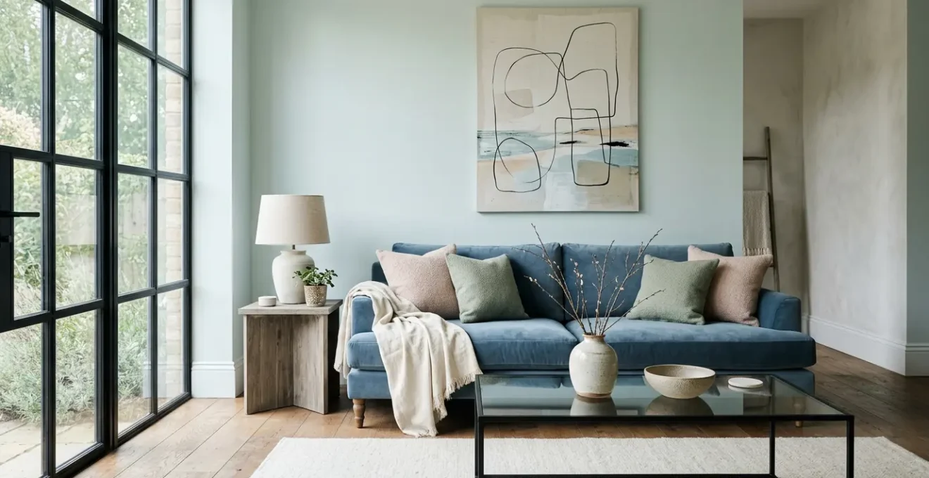
The secret to a sophisticated pastel living room isn’t avoiding soft colors, but mastering the contrasts that give them structure and maturity.
- Dark accents provide essential visual weight to ground the softness of pastels.
- High-CRI lighting is non-negotiable as it reveals the true, complex undertones of your paint.
Recommendation: Focus on the interplay of light, texture, and undertones—not just the primary color—to achieve an elegant and calm atmosphere.
The allure of a pastel living room is undeniable. It promises a serene, light-filled space reminiscent of coastal calmness and gentle spring mornings. Yet, a common fear holds many back: the risk of the final design looking less like a sophisticated retreat and more like a children’s nursery. You’ve likely seen the standard advice: pair pastels with a sea of white, use them only for small accents, or stick to a single, muted shade of dusty rose or sage green. While safe, this cautious approach often misses the true potential of a pastel palette and fails to address the core issue.
The conventional wisdom treats pastels as fragile colors that must be handled with extreme care. But what if the key to a mature pastel interior wasn’t about dilution, but about intentional contrast? The true art lies not in how much pastel you use, but in how you ground it. A grown-up pastel scheme is a delicate balancing act of visual weight, textural reflectivity, and color temperature. It’s about understanding the science of how light and surface interact to transform a simple pale blush or a soft mint into something with depth and character.
This guide moves beyond the surface-level tips. We will deconstruct the principles that separate a “sweet” room from a “sophisticated” one. We will explore why dark accents are structurally essential, how the wrong light bulb can sabotage your color choice, and which fabrics serve both beauty and practicality. By mastering these foundational concepts, you can confidently create a pastel living room that feels both calming and resolutely adult.
Here, we will delve into the specific strategies and principles that empower you to use pastels with confidence, ensuring a result that is elegant, timeless, and perfectly tailored to a mature aesthetic.
Summary: Mastering the Art of the Adult Pastel Interior
- Why You Need Black Accents to Anchor a Pastel Color Scheme
- Why Your Pale Blue Paint Looks Grey in the Evening
- Velvet vs. Linen: Which Pastel Fabric Hides Dirt Better?
- Beige or Grey: Which Is the Best Base for a Pastel Palette?
- How to Warm Up a Pastel Room for Christmas Decor?
- Why Your Salad Looks Grey Under Cheap LEDs: The Importance of CRI
- Velvet or Cotton: Mixing Textures on a Linen Sofa
- How to Achieve the Hamptons Look Without Living Near the Beach?
Why You Need Black Accents to Anchor a Pastel Color Scheme
The primary concern with pastel-heavy rooms is that they can feel floaty, undefined, and lacking in substance. Without a proper anchor, the soft colors can blend into one another, creating a saccharine effect. The solution is not to add more neutrals like white or cream, but to introduce elements with significant visual weight. Black is the ultimate anchor; it provides structure, definition, and a touch of graphic modernity that instantly elevates a pastel scheme from sweet to sophisticated.
Think of black accents as the punctuation in your design sentence. A thin black metal picture frame, the leg of a coffee table, or a sculptural floor lamp doesn’t overwhelm the softness but instead provides a crisp outline that makes the pastels appear more intentional and vibrant. This technique creates a necessary tension. The deep, light-absorbing quality of black offers a grounding counterpoint to the light-reflecting nature of pastels, resulting in a balanced and dynamic composition. As interior designer Kate Guinness notes, this balance is key to a mature look.
Pastels are very versatile, mix with pale to mid-tones to create a balanced interior that feels more grown up rather than sickly sweet
– Kate Guinness, Homes & Gardens – Pastel Living Room Ideas
The goal is to use black strategically, not liberally. Introducing it through architectural details or functional hardware ensures it feels integrated rather than tacked on. This small dose of darkness gives the eye a place to rest, adds depth, and frames the delicate beauty of the pastels, allowing them to shine without becoming overwhelming.
Why Your Pale Blue Paint Looks Grey in the Evening
You’ve found the perfect shade of pale, coastal blue. It looks stunning on the sample card and glorious in the morning sun. But as evening approaches, it mysteriously morphs into a flat, lifeless grey. This frustrating phenomenon is not a fault in the paint but a scientific principle known as metamerism. It occurs when two colors appear to match under one light source but differ under another. This is especially prevalent in complex, muted colors like pastels, which are composed of multiple pigments.
A pale blue is never just “blue”; it contains subtle undertones of grey, green, or even lavender. Throughout the day, the light in your room changes dramatically in temperature. Morning light is bright and cool (higher Kelvin temperature), which accentuates the blue pigments. In contrast, the warm, yellow-toned light from typical incandescent bulbs or the low light of dusk (lower Kelvin temperature) can neutralize the blue and bring its grey or green undertones to the forefront. According to color experts, certain hues are particularly vulnerable to this effect; complex hues like purple, brown, mauve, sage green, and celadon are most susceptible to this noticeable color shift.
This image below illustrates how the same painted surface can reveal drastically different characteristics based on the light that hits its texture.
As you can see, the interaction between light and pigment is incredibly nuanced. To combat metamerism, it’s crucial to test large paint swatches on multiple walls within the room and observe them at all times of day—morning, noon, and night, under both natural and artificial light. This is the only way to truly understand how a color will behave in your specific environment and avoid the disappointment of a perfect pastel turning into a dreary neutral after sunset.
Velvet vs. Linen: Which Pastel Fabric Hides Dirt Better?
When choosing upholstery for a pastel living room, aesthetics and practicality must go hand-in-hand. Pastel fabrics, by their nature, seem prone to showing every speck of dust and every accidental spill. However, the fabric’s material and structure play a far greater role in hiding everyday dirt than the color itself. The two most popular choices, velvet and linen, offer completely different performances in this regard, a difference rooted in their unique textural reflectivity and weave.
Pastel velvet is surprisingly practical. Its dense, vertical pile creates a surface with natural highlights and shadows. This inherent variation in light reflection acts as a natural camouflage, effectively obscuring small crumbs, lint, and light dust. The sheen of the velvet catches the eye, drawing attention away from minor imperfections. Conversely, pastel linen, with its flat, matte, and open weave, is less forgiving. Its texture can trap dust, and because the surface is uniform, any mark or stain becomes immediately visible. Liquid spills also tend to spread more noticeably on linen’s absorbent fibers.
The following table breaks down the key characteristics of each fabric, providing a clear guide for choosing the right material for your lifestyle, as detailed in an insightful analysis of modern pastel trends.
| Characteristic | Pastel Velvet | Pastel Linen |
|---|---|---|
| Weave Structure | Dense pile with vertical fibers | Open, flat weave with visible texture |
| Light Reflection | Creates natural highlights and shadows that camouflage imperfections | Matte surface shows every mark and variation |
| Dirt Visibility | Obscures small crumbs and light dust due to pile depth and sheen | Traps dust in weave; liquid stains spread visibly |
| Oil Retention | Dense pile can trap body oils over time | Less prone to oil absorption but stains more obviously |
| Modern Solution | Performance velvet with stain-resistant treatment | Performance linen with cleanable, treated fibers |
| Best Use Case | High-traffic areas needing luxe aesthetic with practical camouflage | Low-traffic, design-focused spaces prioritizing coastal texture |
Ultimately, the choice depends on the room’s function. For a busy family living room, a performance velvet in a soft blush or powder blue offers a luxurious look with surprising durability. For a more formal, low-traffic space where the coastal, textural quality is paramount, linen remains a beautiful, albeit more demanding, option.
Beige or Grey: Which Is the Best Base for a Pastel Palette?
Choosing the right neutral base is one of the most critical decisions in designing a pastel interior. For years, cool grey has dominated as the go-to modern neutral, while classic beige was often seen as dated. However, when pairing with pastels, the “best” neutral isn’t about trends; it’s about chemistry. The success of your palette depends entirely on matching the undertones of your pastel with the undertone of your neutral base.
Every color, including neutrals, has a warm (yellow, red) or cool (blue, green) undertone. A cool-toned pastel, like lavender or mint green, will harmonize beautifully with a blue-based grey, creating a cohesive and serene atmosphere. Pairing that same lavender with a yellow-based beige, however, can create a visual clash, making the colors look muddy and dissonant. Conversely, a warm pastel like peach, coral, or buttery yellow will come alive against a warm beige but can look stark and cold next to a cool grey. An emerging, highly versatile option is “greige,” a hybrid of grey and beige that often contains both warm and cool undertones, allowing it to adapt to a wider range of pastels.
Some designers even argue for using pastels themselves as the primary neutral. As interior designer Sophie Chapman suggests, a very soft peach or blush can function as a gentle alternative to standard white or cream, infusing the room with color and depth from the ground up.
To determine the right pairing, always test your chosen pastel against your potential neutral base in the room’s actual lighting. Hold the samples next to each other to see if they create a sense of harmony or discord. This simple test is the most effective way to ensure your foundational colors work together to create the sophisticated, calm environment you envision, preventing costly mistakes and ensuring a palette that feels intentional and expertly curated.
How to Warm Up a Pastel Room for Christmas Decor?
Decorating a pastel living room for the winter holidays presents a unique challenge. The traditional palette of bold reds and forest greens can clash jarringly with a soft, airy pastel scheme, destroying the carefully curated calmness. The key to a successful seasonal transition is not to fight the existing palette with overwhelming color, but to enhance it by layering in warmth through texture and light.
Instead of introducing competing colors, focus on swapping materials. Replace lightweight linen cushions with chunky wool knit or rich velvet throws in deeper, more saturated versions of your existing pastels—think a deep plum instead of lavender, or a rust instead of peach. Introduce accents of cream, camel, and warm metallics like copper or brass. These elements add tactile and visual warmth without disrupting the color story. Faux fur throws or a plush, high-pile rug can instantly make the space feel cozier and more inviting for winter.
Lighting is your most powerful tool. Swap out cool, bright overhead lights for warmer, ambient sources. A study on seasonal transformations highlights the effectiveness of this approach.
Case Study: Texture-First Seasonal Transformation
Interior designers successfully transformed pastel living rooms for winter holidays by prioritizing texture over color changes. As detailed in a review of inspiring pastel interiors, instead of introducing jarring reds and greens, they swapped cool linen cushions for chunky wool knit throws in cream and camel tones, added faux fur accents in deeper shades of existing pastels, and introduced velvet in rich burgundy as a sophisticated festive accent. This texture-first strategy maintained the pastel foundation while creating warmth through tactile layers and warm-toned lighting at 2700K, proving that seasonal décor can enhance rather than compete with a pastel scheme.
Finally, engage the other senses. Introduce seasonal scents like cinnamon, pine, or spiced orange through candles or diffusers. This sensory layering creates a perception of warmth that goes beyond the visual, making your pastel haven feel like a festive and cozy retreat throughout the holiday season.
Why Your Salad Looks Grey Under Cheap LEDs: The Importance of CRI
You’ve meticulously chosen your pastel paint, but something is still off. The colors feel flat, muddy, and lack the vibrancy you expected. The culprit is likely not the paint but your lighting. While we often focus on the warmth (Kelvin) of a light bulb, the Color Rendering Index (CRI) is a far more critical factor for interiors rich in subtle color. CRI is a scale from 0 to 100 that measures a light source’s ability to reveal the true colors of objects compared to natural sunlight. For a sophisticated pastel palette, high-CRI lighting is non-negotiable.
Cheap LED bulbs often have a low CRI (typically below 80). This means they emit a limited spectrum of light, failing to render the full range of tones in your decor. Under low-CRI light, a complex sage green can look like a dull grey, and a delicate blush pink can appear washed out and lifeless. The rich, subtle undertones that give pastels their character are simply lost. It’s the same reason a fresh, vibrant salad can look unappetizing and grey under the poor lighting of a cheap restaurant.
To do justice to your color choices, you must invest in lighting with a high CRI. The industry standards are clear: according to Westinghouse lighting guidelines, a CRI of 80-90 is considered good, while 90+ is excellent for applications where color accuracy is crucial. By choosing bulbs with a CRI of 90 or higher, you ensure that your lighting is rendering the full spectrum of color. Your pastels will appear as they were intended: rich, complex, and true to their hue, day or night. This single technical choice can make the difference between a room that feels flat and one that feels vibrant and alive.
Velvet or Cotton: Mixing Textures on a Linen Sofa
A linen sofa provides a perfect, matte foundation for a coastal-inspired pastel living room. Its natural, breathable texture evokes a sense of casual elegance. However, a room composed solely of matte textures can feel one-dimensional and lack visual interest. The key to creating a dynamic and inviting space is to layer contrasting textures on top of this neutral base, a technique that relies on playing with light reflection and tactile sensation.
Introducing velvet cushions to a linen sofa is a classic designer move for a reason. The deep pile and subtle sheen of velvet catch the light in a completely different way than the flat weave of linen. This contrast makes the same pastel color appear richer and more saturated in velvet form, creating instant depth and a touch of luxury. The juxtaposition of the slick, plush velvet against the relaxed, slightly rougher linen is both visually and texturally stimulating.
But don’t stop at two textures. To achieve a truly curated and cozy look, aim for a third layer. This could be a chunky wool or boucle throw for ultimate softness, or a waffle-weave cotton blanket for a more structured, graphic element. This “Rule of Three” for textures ensures the space feels collected and thoughtfully designed, rather than staged. By using the same pastel hue across these different materials, you can create a sophisticated tonal look where the variation comes from how each surface interacts with light, rather than from a jumble of different colors.
Your Action Plan: The Rule of Three for Texture Layering
- Base Layer: Start with your linen sofa as the matte, breathable foundation texture that sets a relaxed tone.
- Luxe Accent Layer: Add velvet cushions for a touch of sheen and depth. This makes pastels appear richer and more saturated by reflecting light differently.
- Cozy Element Layer: Introduce a third texture like a wool, boucle, or waffle-weave cotton throw for tactile warmth and casual softness.
- Cohesive Color Strategy: Use the same pastel color across the different textures to create subtle tonal variation through light reflection, not jarring color changes.
- Final Check: Step back and ensure the textures are balanced, creating a space that invites touch and feels visually layered and complete.
This deliberate layering of textures is what transforms a simple sofa into the focal point of a warm, sophisticated, and multi-dimensional living room.
Key Takeaways
- Anchor pastels with dark accents like black to provide essential visual weight and structure.
- Understand that lighting is paramount; high-CRI bulbs (90+) reveal the true, complex undertones of your pastel paints.
- Create depth and sophistication by layering contrasting textures, such as matte linen, lustrous velvet, and cozy wool.
How to Achieve the Hamptons Look Without Living Near the Beach?
The Hamptons look is less a specific decorating style and more an ethos of effortless, inherited elegance. Its core is about maximizing light and creating a sense of spacious, breezy comfort. You don’t need an ocean view to capture this spirit; you can recreate it anywhere by focusing on its foundational principles: scale, light, and the balance of pristine versus patina. This final element is the secret that prevents a coastal-themed room from feeling like a sterile hotel and instead gives it authentic, lived-in soul.
First, manipulate the perception of light and scale. Hang curtains at ceiling height and extend the rods far beyond the window frames to create the illusion of larger, grander windows. Choose substantial, comfortable furniture, but ensure it has visible legs. Elevating sofas and armchairs off the floor creates visual flow underneath, making any room feel larger and airier. Use oversized artwork or a large-scale mirror as a focal point; this emulates the gallery-like feel of spacious Hamptons homes.
The most crucial element, however, is the “pristine vs. patina” balance, a concept highlighted in studies of authentic coastal interiors.
Case Study: Hamptons Style Ethos in Urban Interiors
As explored in an analysis by Livingetc, designers successfully recreated Hamptons aesthetics in urban apartments by focusing on this core balance. They paired pristine elements, like crisp white linen slipcovers and a fresh pastel palette, with key pieces showing patina. A weathered wood coffee table, a vintage rug with subtle wear, or an antique gilded mirror provided the necessary history and texture. This contrast between the new and the old, the perfect and the perfectly imperfect, is what creates the feeling of a home that has been lovingly curated over generations, which is the true heart of the Hamptons style.
By combining these strategies—maximizing perceived light and space while intentionally mixing crisp new items with character-rich vintage pieces—you can achieve the sophisticated, calm, and timeless Hamptons look in any home, regardless of its proximity to the coast.
By focusing on these core principles—anchoring with weight, understanding light, layering textures, and balancing the new with the old—you can move beyond fear and unlock the true potential of pastels. Your living room can become the sophisticated, serene, and deeply personal sanctuary you envision.